UX & product design
Deep dive
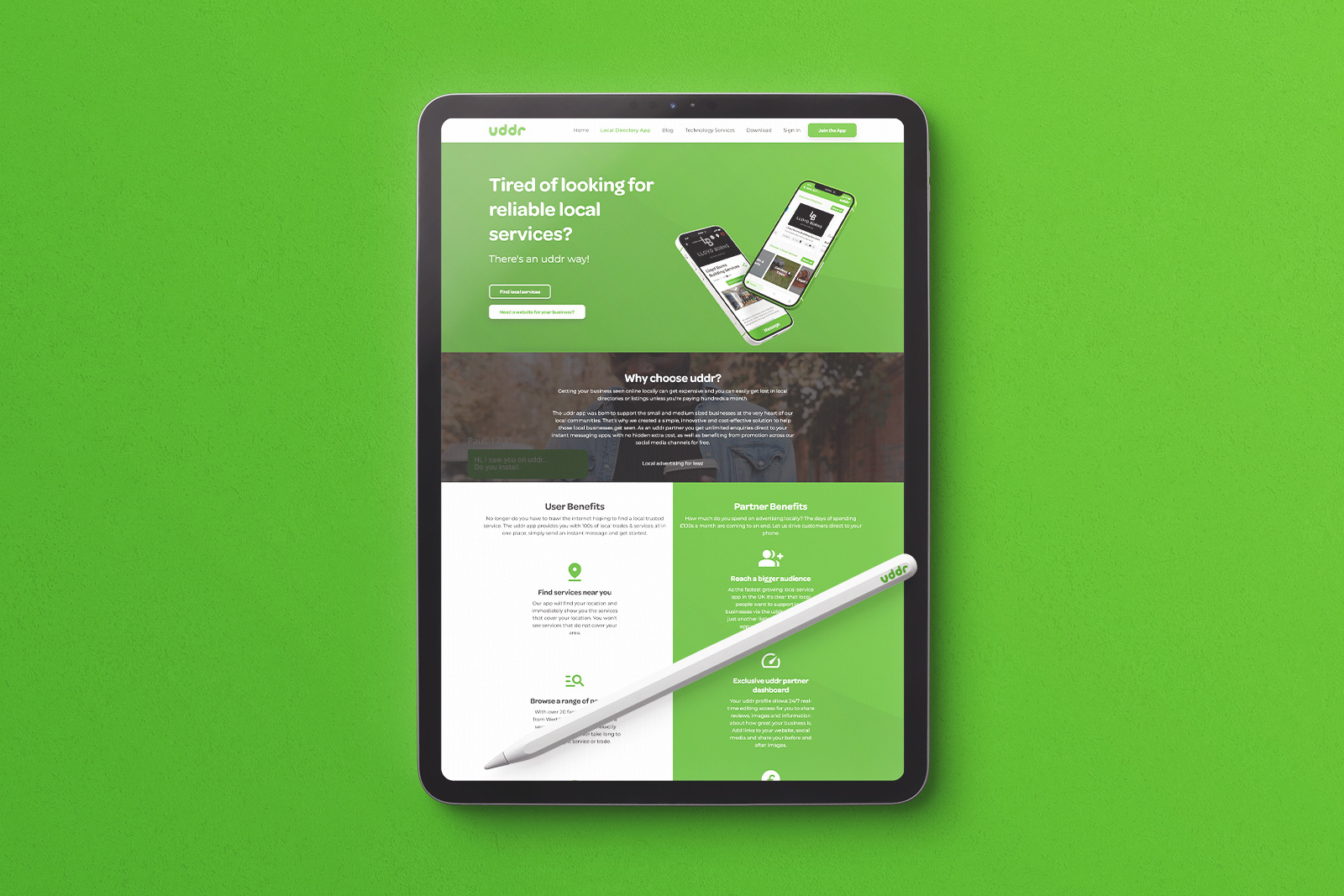
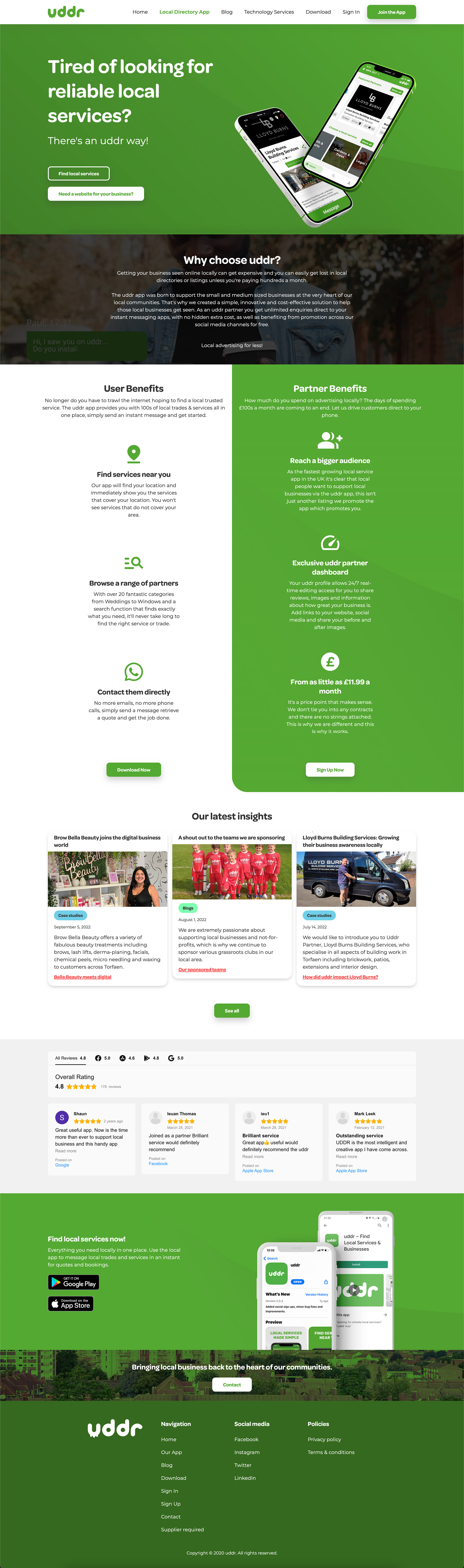
Uddr needed a new web presence and a better sign-up experience for their platform. I came in as lead designer and took both from brief to live.
The existing setup wasn't doing the job. The CMS was outdated, the sign-up flow was losing potential users, and there was no coherent product story being told to visitors arriving on the site.
My remit covered the marketing site, the CMS platform underpinning it, and the web application users encountered when signing up. Three connected surfaces, each with different user needs.
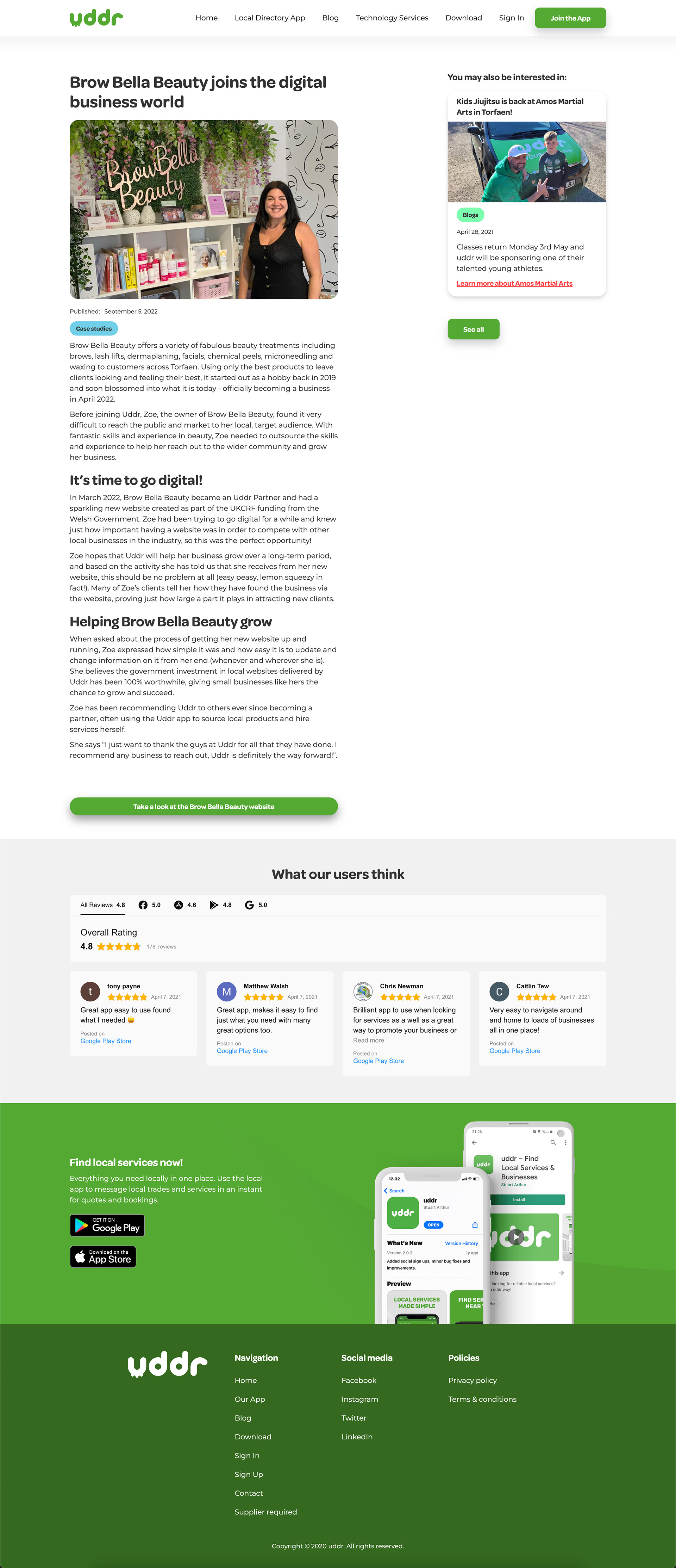
On the marketing side, I designed and built a new CMS platform — structure, architecture, and visual design — that gave the team the flexibility to manage content without breaking anything. The goal was something they could actually maintain.
On the product side, I redesigned the sign-up flow. The old version was creating unnecessary friction at exactly the point where you most need to keep people moving. I worked through the user journey with the Uddr team, identified where people were dropping off, and redesigned the key steps to reduce cognitive load and make progress feel clearer.
I managed a small team of developers and a junior designer through the build. That meant balancing design intent against technical reality — being clear about what mattered and what could flex — and keeping the quality bar consistent across both workstreams.
Both workstreams went live. The sign-up experience was measurably cleaner. The CMS gave the team back control of their own content, which was the practical win they needed most.
It was also a reminder that managing people through a build is its own design challenge. Getting a junior designer to understand why something isn't working — rather than just telling them to change it — is where a lot of the real craft lives.