
Service design
UX & product design
I worked with the Trade Remedies Authority as part of Capgemini, joining the project as Lead Designer and Service Designer across a strategic piece of work that focused as much on design thinking and direction as it did on outright UX design. The TRA is the UK's independent body responsible for investigating trade remedies cases following Brexit, and the work I led was central to shaping how the service would move through alpha and towards beta.
The user-centred design team was made up of just myself and one content designer, which meant the project was massively understaffed for the scope and ambition of the work. As well as leading design across the project, I was the Service Designer too — working closely with developers, business analysts and the client to keep the design direction joined up across multiple disciplines.
A large part of this role was design strategy and thinking, as much of the work was about shaping direction, framing problems and managing uncertainty rather than producing finished UI. Everything was designed following GDS and accessibility best practice, while working within the constraints of the chosen technical solution.
Before I joined the project, the service had failed its alpha assessment with a red rating in design. The team was working with a very difficult client, lots of uncertainty around what alpha and beta should look like, and goal posts that were moving constantly. There was no previous design documentation in place, no clear ways of working between design and development, and no agreed process for sign off or user story creation.
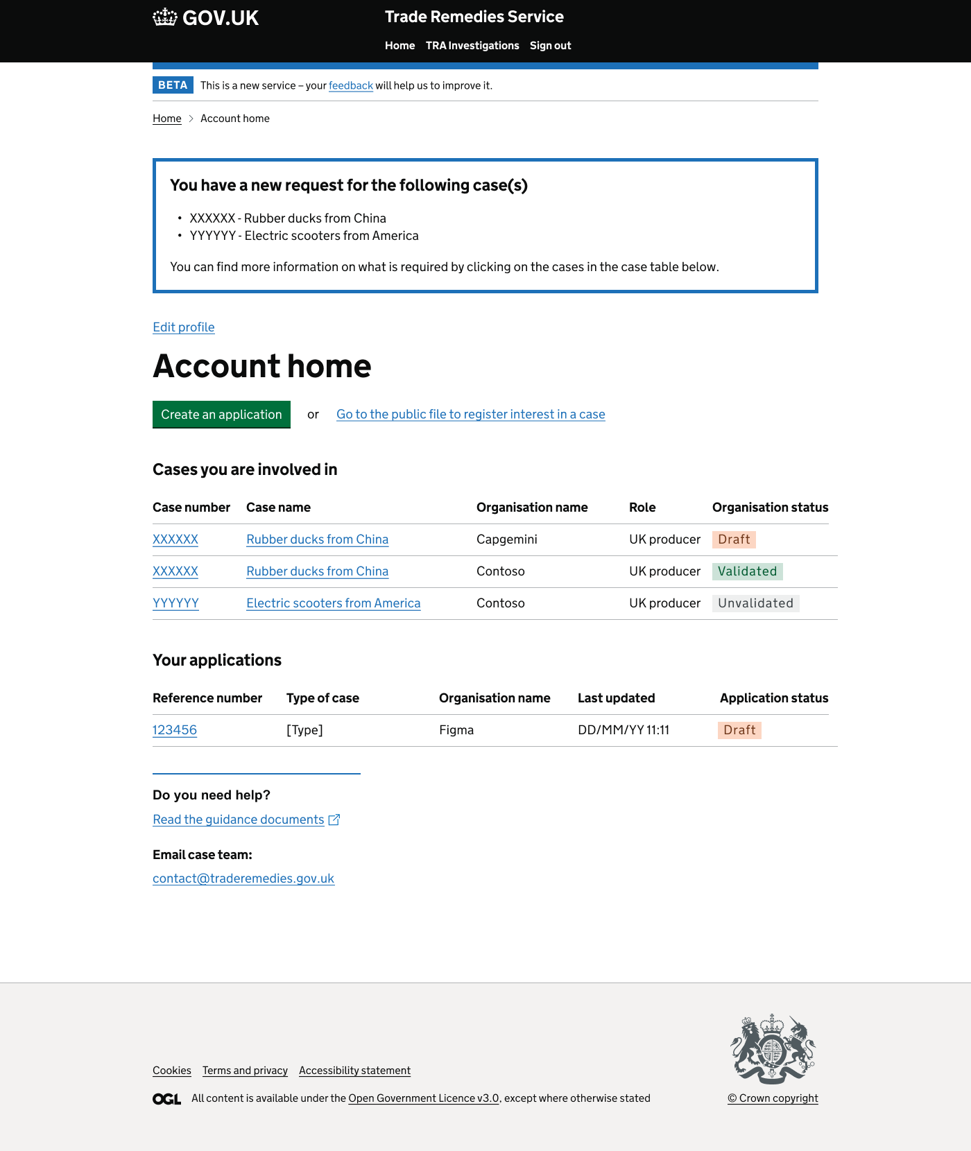
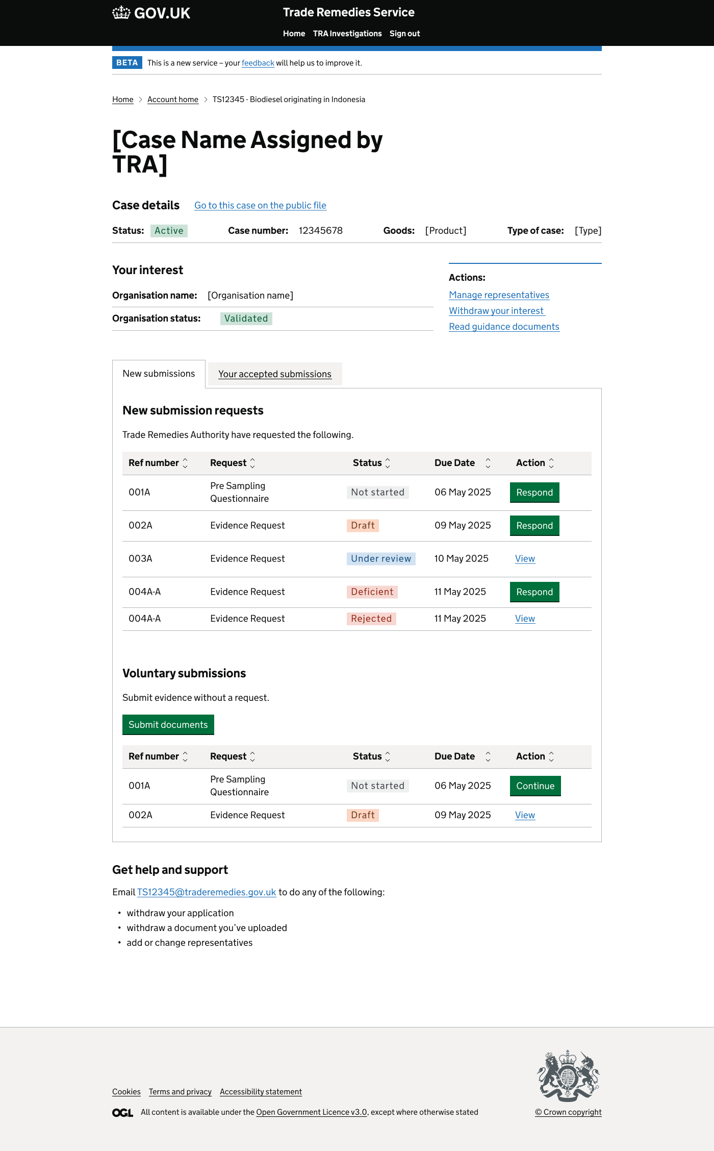
The service was being built on Power Pages for the public-facing side, with internal tooling built on MS Dynamics. This created a real tension for the project — Power Pages meant we couldn't follow the GDS Design System word for word, so a lot of the design work was about justifying why we couldn't follow GDS in certain places and clearly evidencing the workarounds we were putting in place to mitigate this.
On top of all of that, the client wanted to skip private beta and jump straight from alpha into public beta, which was a massive issue for the team and created ongoing uncertainty about whether we would actually make a public beta assessment at all (in the end, we didn't).
The first piece of work was strategic rather than visual. I spent time understanding why alpha had failed, where the gaps were across design, research and ways of working, and what needed to change to get the project to green.
From there I led on rebuilding the design practice on the project — introducing better ways of working with developers and, because there was no previous design documentation, putting a clear documentation approach in place from scratch so that decisions, patterns and rationale were captured and traceable.
I also integrated the design export with the technical documentation, so handover between disciplines was simple and design and engineering were working from the same source of truth.
A lot of the work focused on managing the constraints of Power Pages and MS Dynamics. Where we couldn't follow GDS to the letter, we documented why, what we were doing instead, and how we were mitigating the impact on the user — so that when assessments came, we had a clear, evidenced design story rather than unexplained deviations.
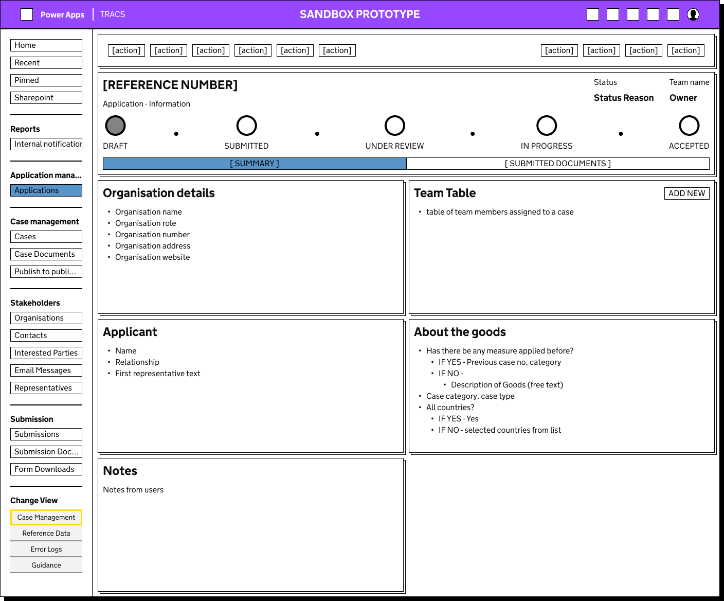
Because the project involved a lot of workshops, decision making and stakeholder management, I created a tool that allowed us to put together low fidelity prototypes very quickly. This was especially valuable on the MS Dynamics side, where mocking up internal tooling screens would normally be slow and expensive.
This tool let us quickly show what a screen could look like, react to it in the room, and move the conversation forward. It meant we could go from a conversation in a workshop to something tangible in front of stakeholders almost immediately, which sped up decision making and helped manage a client who needed to see ideas in order to react to them.
Alongside the design work, I spent time with the Business Analyst to create a clear sign off process and well-structured user stories, which gave the wider team a shared definition of done and made it much easier to plan and prioritise around constantly shifting goal posts.
I also worked closely with the developer testers, helping them test the product and document known bugs so that issues were captured properly rather than getting lost between disciplines.
After I joined the project, alpha was passed with all areas previously rated red updated to green. The ways of working I introduced between design and development meant handover became much smoother, with design documentation and technical documentation aligned so developers had a single, reliable reference point.
The rapid low fidelity prototyping tool became a core part of how we ran workshops and made decisions, particularly for the MS Dynamics internal tooling, where being able to quickly mock up a screen made conversations far more productive.
The work to clearly justify deviations from GDS, driven by the constraints of Power Pages, gave the project a defensible design narrative and a much more mature design practice.
The sign off and user story process I created with the BA gave the project a clearer rhythm, and the time spent supporting dev testers meant bugs were tracked and resolved more consistently.
Ultimately the client's decision to push from alpha straight to public beta meant we didn't make a public beta assessment, and a lot of the value I added wasn't in finished UI but in the strategy, framing and decision making that kept the project moving through a period of significant uncertainty.
