Deep dive
Service design
UX & product design
I worked at DLUHC in the Funding Service Design team, responsible for the design of onboarding, applications and assessments of new funds. There was not a single source of managing applications and assessments in central government for DLUHC. After Brexit, the EU took away funding management tools.
I worked on the DLUHC project for almost 12 months, and during this time I led design of various product enhancements and new features for assessment and application tools. I worked with different fund teams such as Community Ownership Fund, NightShelter, High Street Rental Auctions and more. As this was a central government project, there were lots of GDS coded prototypes used before we eventually moved to Figma. Everything was designed following GDS and accessibility best practice as we were preparing for a GDS assessment pre-election.
The assessment tool did not allow assessors to be able to assign work to other assessors, currently this was being tracked outside of the tool, on a variety of MS powered apps, such as teams and Excel. This meant that there was no way of an assessor being automatically notified when they were assigned new work, causing some applications to slip through and not get assessed before the end of the assessment deadline. There was no clear way for an assessor to see what was assigned to them, or what they had assigned to other assessors in the tool.
The following work that was designed was the largest piece of work that I had done at DLUHC and completely changed how the assessors would interact with the tool. We already had a lot of findings from previous work that gave us a good idea of what needed to be improved. We also did further observational research sessions to observe any sticking points in the current process as assessors would go through the assessment workflow. There were multiple user pain points that needed to be rectified, in addition to features that were currently missing from the tool. Using content and interactions best practices new designs were ideated and played back to assessors at various stages to refine and shape the designs to the users needs.
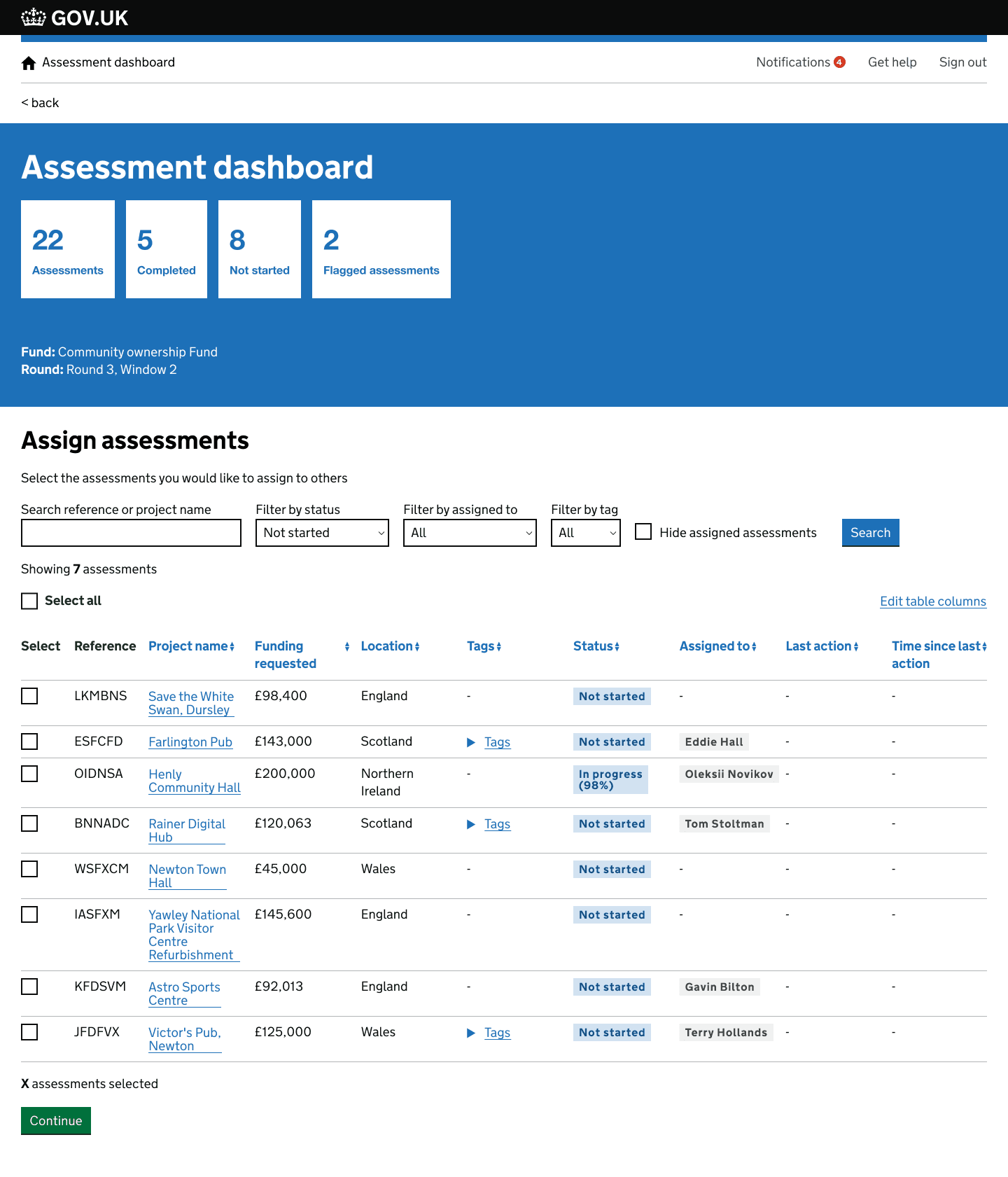
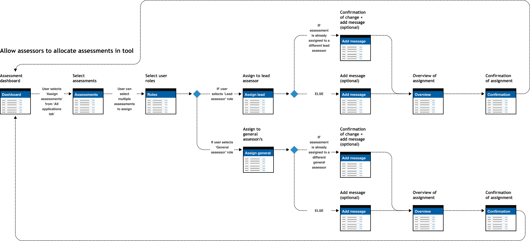
I designed a tabbed feature that would allow assessors to toggle between different views in the tool, showing them exactly what they needed to see throughout the assessment stage. Tabs would allow a lead assessor to see what they were responsible for as a team lead and what assessments were assigned to them. Additional filters and search functions were added to allow an assessor flexibility and control over what they needed to see. A new checkbox filter function was also added allowing an assessor to see assessments that were unassigned in the tool.
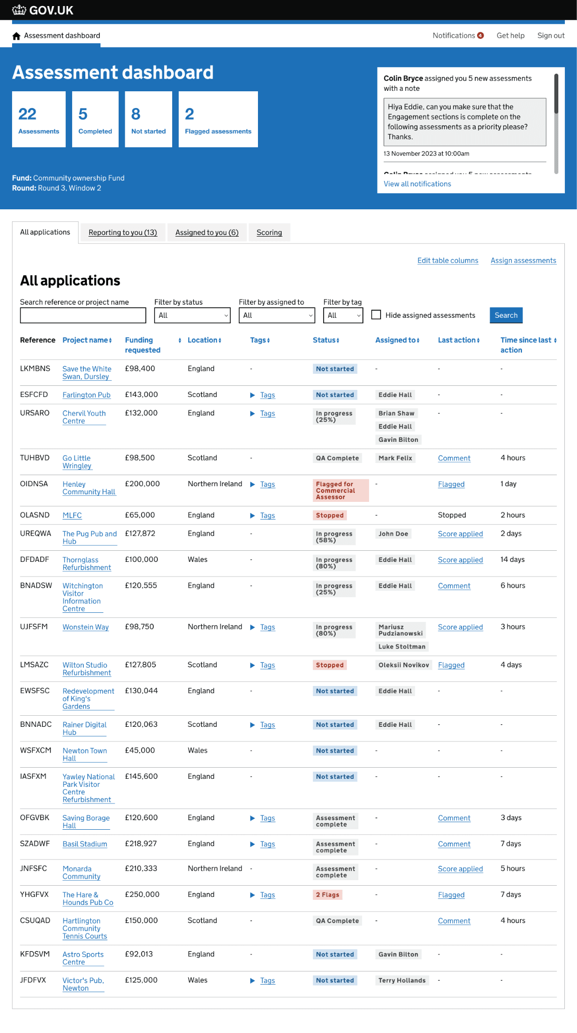
Notifications were added to the tool, allowing for notifications to be sent to an assessors email as well in tool notifications. This helped to create a source of truth in the tool and allowed assessors to easily see when new work had been assigned and what they needed to do. A simple table format was used in it's early stage to display data so that new types of notifications could be added to the tool in the future without breaking the user experience of this function.
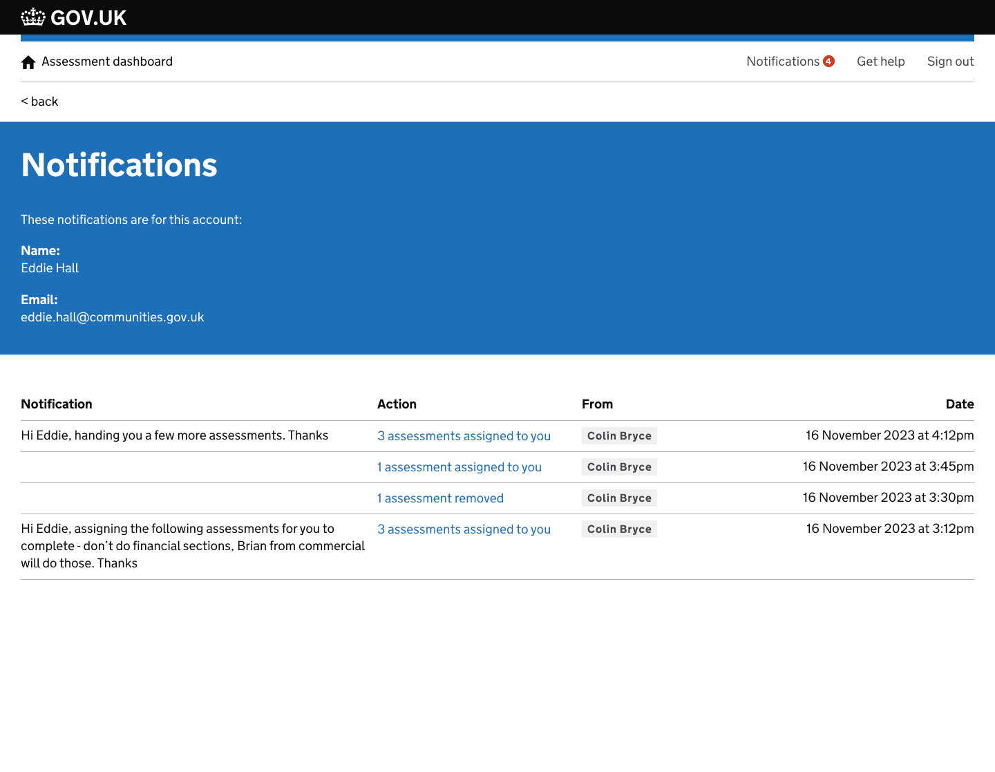
I also designed a feature allowing assessors to be able to assign work within the tool. A bulk allocation function was added allow an assessor to be able to select multiple assessments for assignment. Messages were added to assignments that would allow an assessor to provide additional instructions about the assignment of work. These optional messages would appear in notifications sent to the assessor.
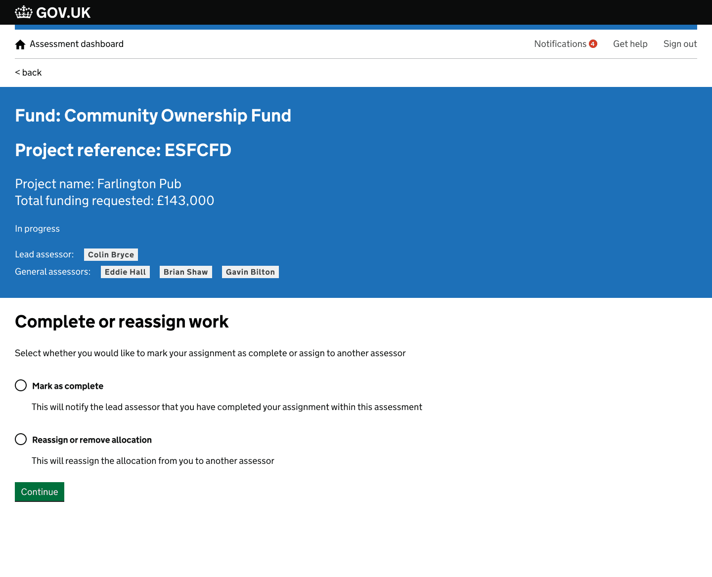
As well as being able to assign assessments to assessors, you would also be allowed to mark an assignment as complete or flag to another assessor if the assessment could not progress further. This made, along with other new design features made the tool a source of truth and helped to take assessors away from managing workload in additional tools outside of the assessment tool. With these designs I was conscious that not all of the assessors communications needed to happen in tool, so I refined it to the most important communication needed in the assessment life cycle.
The assessor workflow enhancements above were the largest piece of design I did at DLUHC, but they built on a year of prior work across the same funding service. Below are four earlier challenges I worked on — covering applicant experience, assessor tooling, and the assessment overview — which set the foundation for everything that followed.
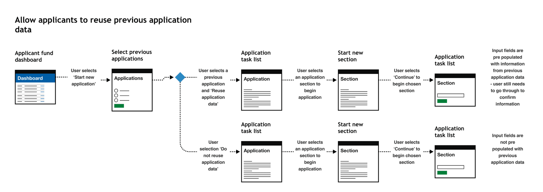
Applicants could apply to an application multiple times at various different points in the application process. An applicant may have ownership of multiple assets in their community, each asset would require a new funding application. There was lots of repetition when applying for multiple funds and this was flagged in analytical data that we were able to access regarding time to complete an application. We were unable to conduct observational research with applicants for legal reasons so had to use the data we had to make improvements
Using the data we had access to, we were able to do some desk research to highlight the problems, we also implemented feedback forms into the service to capture additional user feedback. We then identified any repetitive data entry points in the application. We worked with the technical partner on the project to get an understanding of any technical considerations that design needed to be aware of before ideating a suitable solution.
I designed a solution whereby users could reuse application information from a previous application. The information that was identified as reusable in this early integration of this feature was organisation information. This often did not change in multiple applications from the same applicant. To ensure validity with the data entry, applications needed to go through the application and review the auto filled data. This ensure the data was accurate and kept up to date. The impact of this design meant that lots of time was saved by the applicant, ensuring more time was spent on the asset value instead of repetitive data entry.
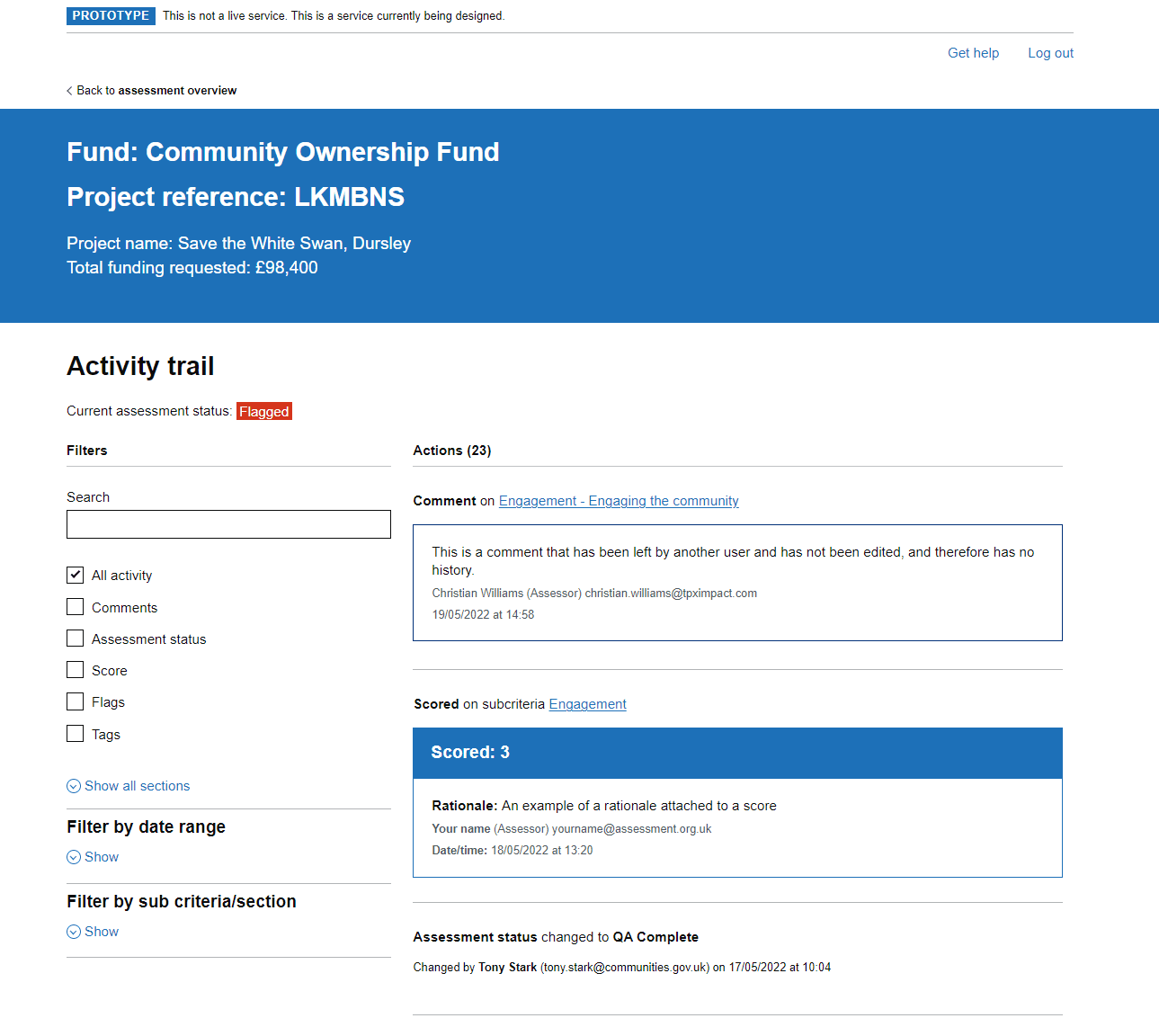
Assessors needed to be able to understand all actions taken on assessment to make informed decisions. They also needed to understand all previous actions on assessment by other assessors to get a clear view of actions taken, why and when. There was no way to track these actions easily in the tool. It was crucial that there was a way of seeing an overview of actions when making funding decision on whether an application was viable or not.
We used desk research and observational research methods, that highlighted the difficulties in picking up an assessment from other assessors. It was highlighted that they was currently no way of being able to see all actions taken on an assessments in a format that was easy to understand and accessible. An audit trail of actions was vital to see what actions took place prior to a decision on an assessment.
I designed a solution whereby users could see an activity trial of an assessment, where an assessor could see any and all possible actions taken on assessment. Additional filtering was included to allow for better control of the data when being audited. We went through a multi stage delivery of this feature with the technical partner, ensuring that GDS best practices were being followed, in addition to progressive enhancement to improve the user experience. We received positive feedback from Grade 7 Assessors, highlighting how this would improve their ways of working in assessment teams due to the flexibility and complete overview this solution provided.
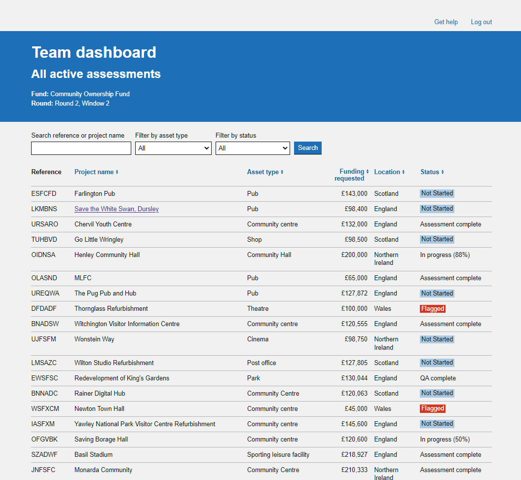
We used observational research to understand exactly what an assessor needed to see when at a high level when viewing more than one fund. We went back and fourth with assessors to understand their needs and refine the design.
A new design was implemented improving the layout with the addition of a search and filtering features to improve oversight of many funds and round/windows within them
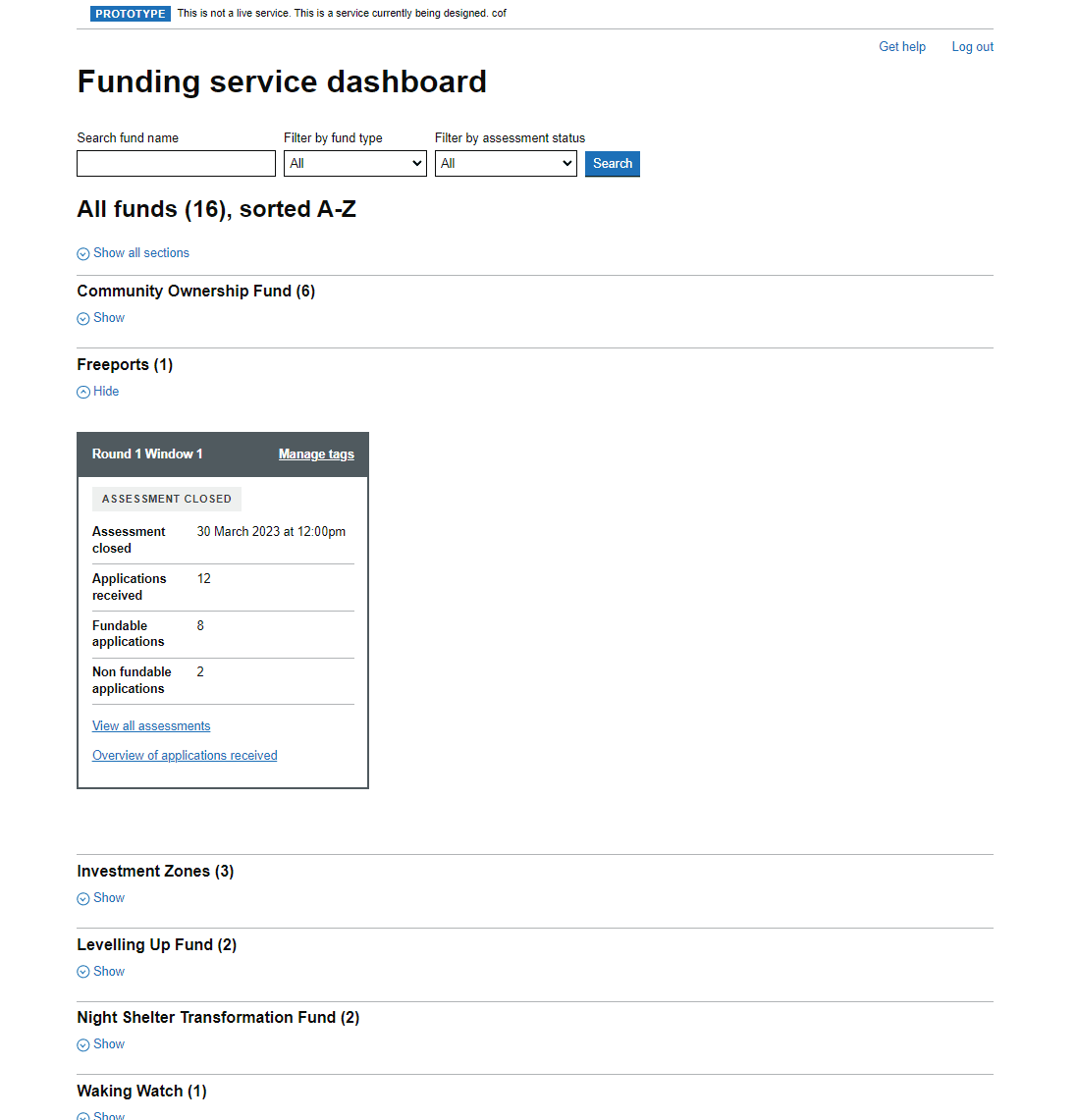
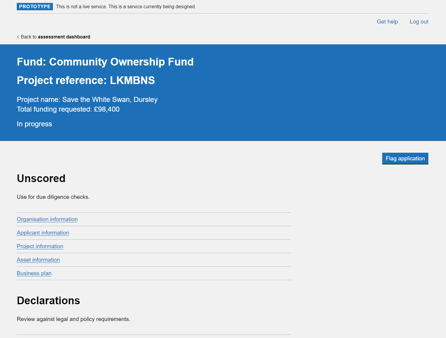
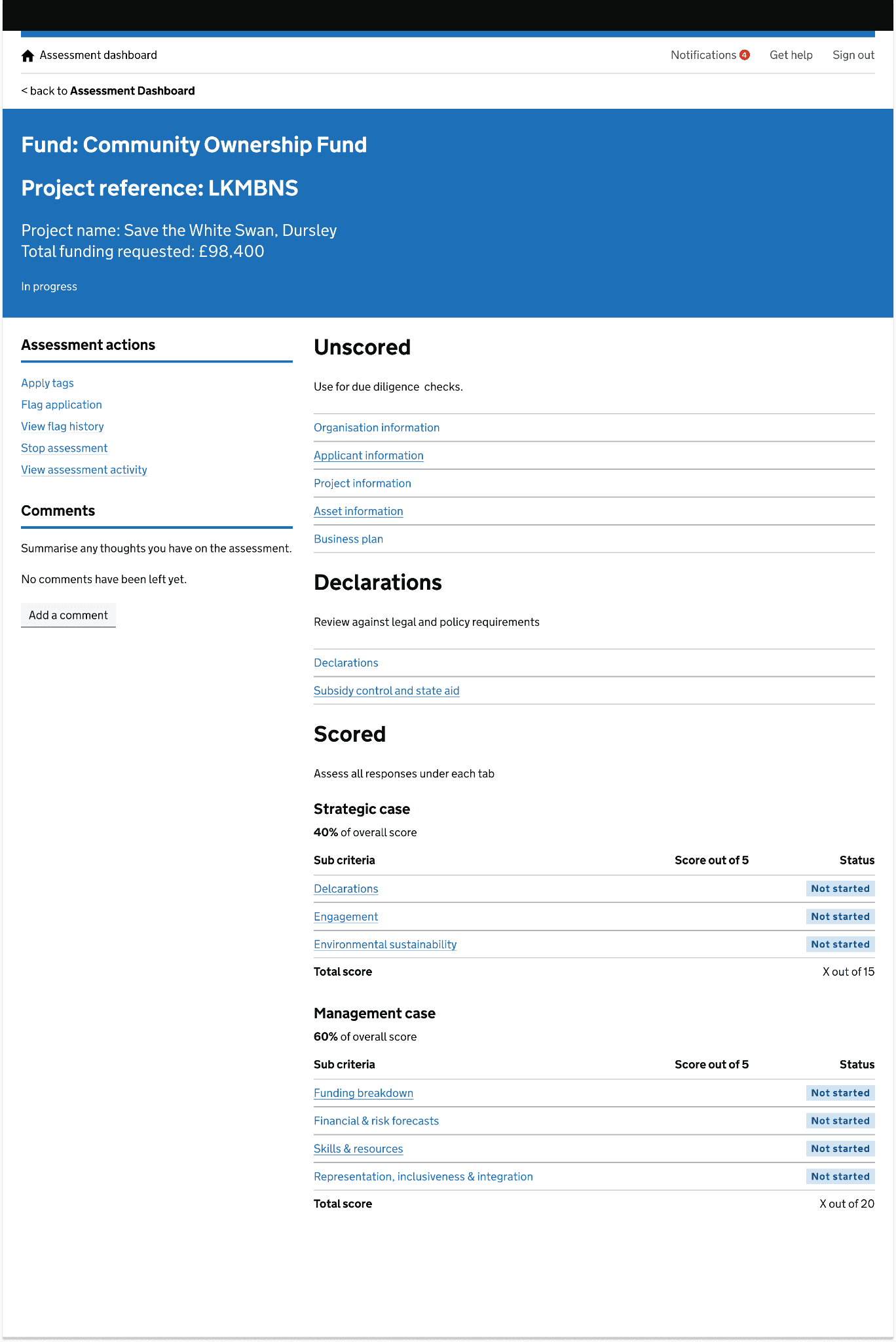
There was a lack of consistency in design on this page, and the page was also missing an ability to be able to leave comments at a high level.
We used desk research and observational research to gain a deeper understanding of what the user was experiencing. It was highlighted the current user experience was messy and unclear, and felt disconnected from the rest of the tool. We discovered that comments were being lost deep in assessment section and these were impacting on the overall funding decision. Using GDS best practices and guidelines, in addition to user patterns already used elsewhere in the tool, I designed a new layout for the assessment overview page.
The new design incorporated existing design patterns and layouts already used elsewhere in the tool to create familiarity in the design and create a better user experience. Assessment actions were now stored neatly on the left, instead of various locations at the top of the page. This new layout also allowed easy introduction of new features into the tool without creating a user interface that would be messy or unclear, and create a bad user experience. The new design was received very well with assessors from multiple funding teams, all highlighting that the new design made the tool easier to use and the assessment process more straight forward.