
Deep dive
UX & product design
Service design
The Royal College of Speech & Language Therapy (RCSLT) was a project I worked on for over two and a half years through Arthurly. I was the only designer on the project throughout. The users of RCSLT's services were speech and language professionals — many of whom worked with, or were themselves, people with learning difficulties. Accessibility wasn't a nice-to-have. It was the job.
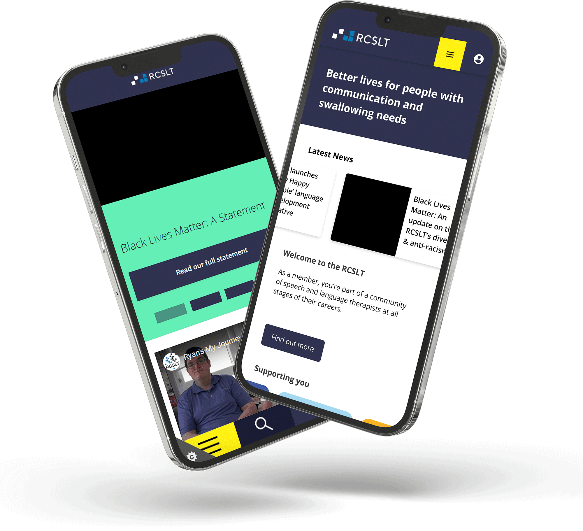
The existing services were not fit for purpose. There had been no serious accessibility thinking in what was already built, and the services were riddled with bugs making basic tasks difficult. The early testing was stark: buttons overlapping and impossible to click on mobile, colour contrast failing accessibility standards, broken links returning 404s across the site, and user journeys that gave no clear path to getting help when things went wrong.
There was also a lot of poor feedback from users on social media, which meant we were up against it from the start. The first move was implementing short-term fixes to stop the bleeding — winning back some basic trust while we worked on the bigger UX changes needed across the whole service.
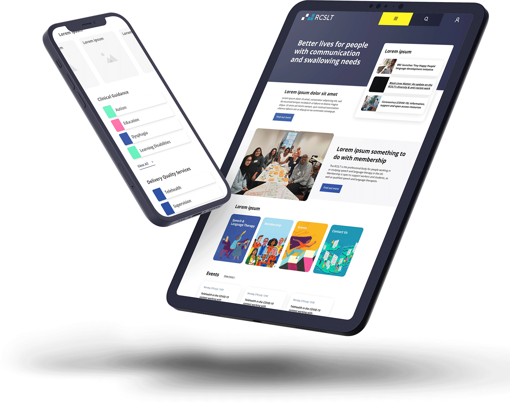
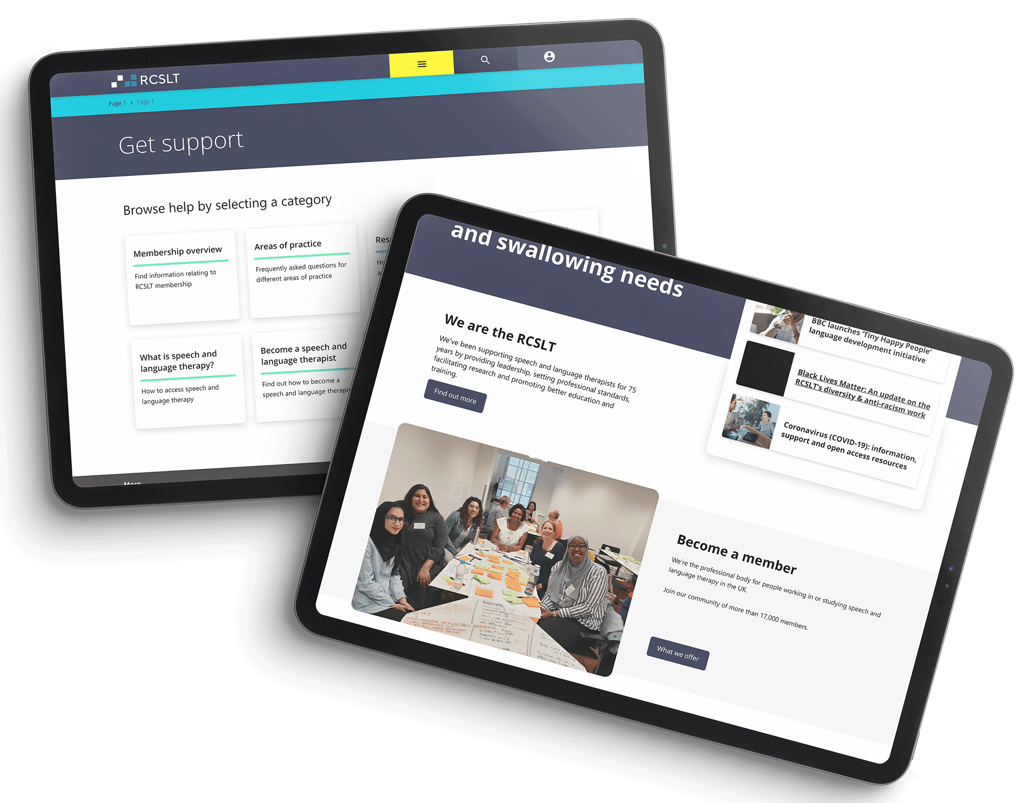
I analysed the existing digital offering and put together a report on what was going wrong and why. From that, we worked with stakeholders to define what the future of the service should look like. The redesign addressed the accessibility failures directly — proper colour contrast, mobile-first interaction design, clear navigation, and a support page that simply hadn't existed before.
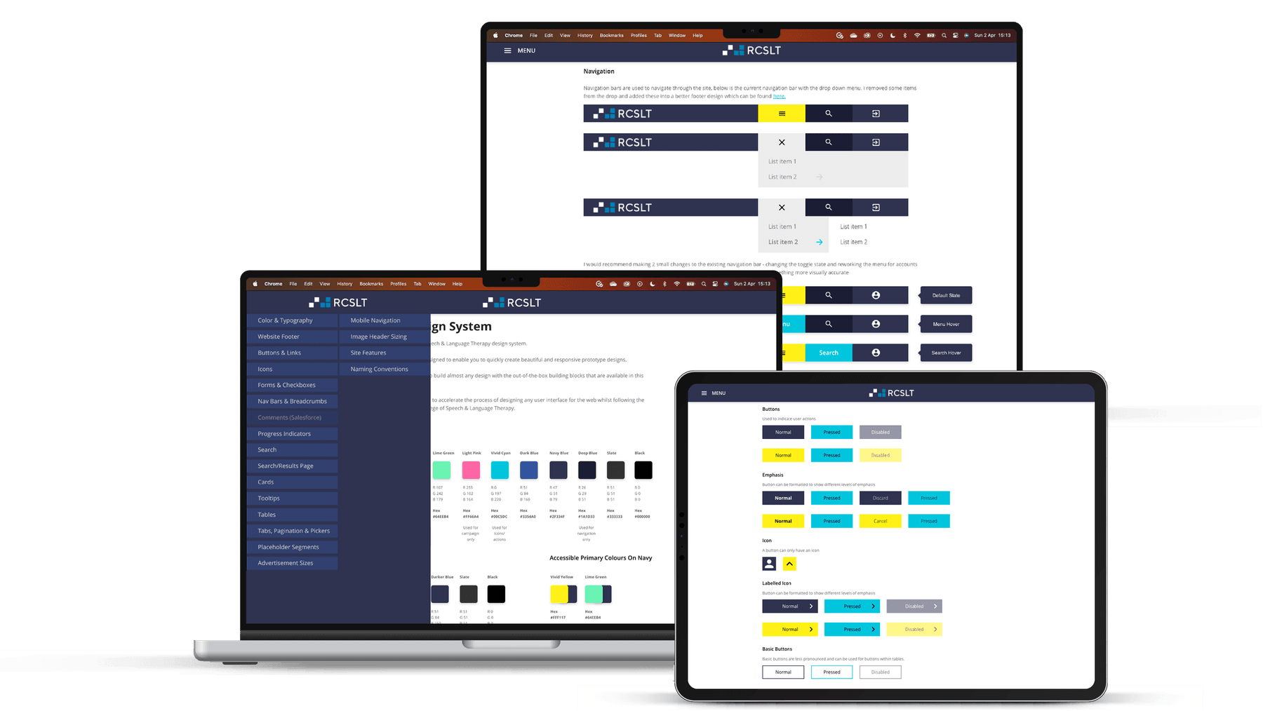
To underpin all of it, I built a design system from scratch. RCSLT had none previously, which meant inconsistencies had crept in across every surface. The system gave me and the developer a shared reference point and made it possible to introduce new components without creating new inconsistencies. Taking the client through why a design system matters — not just showing them the outputs — was part of the work too. More understanding from their side meant fewer last-minute changes and a better working environment for the team.
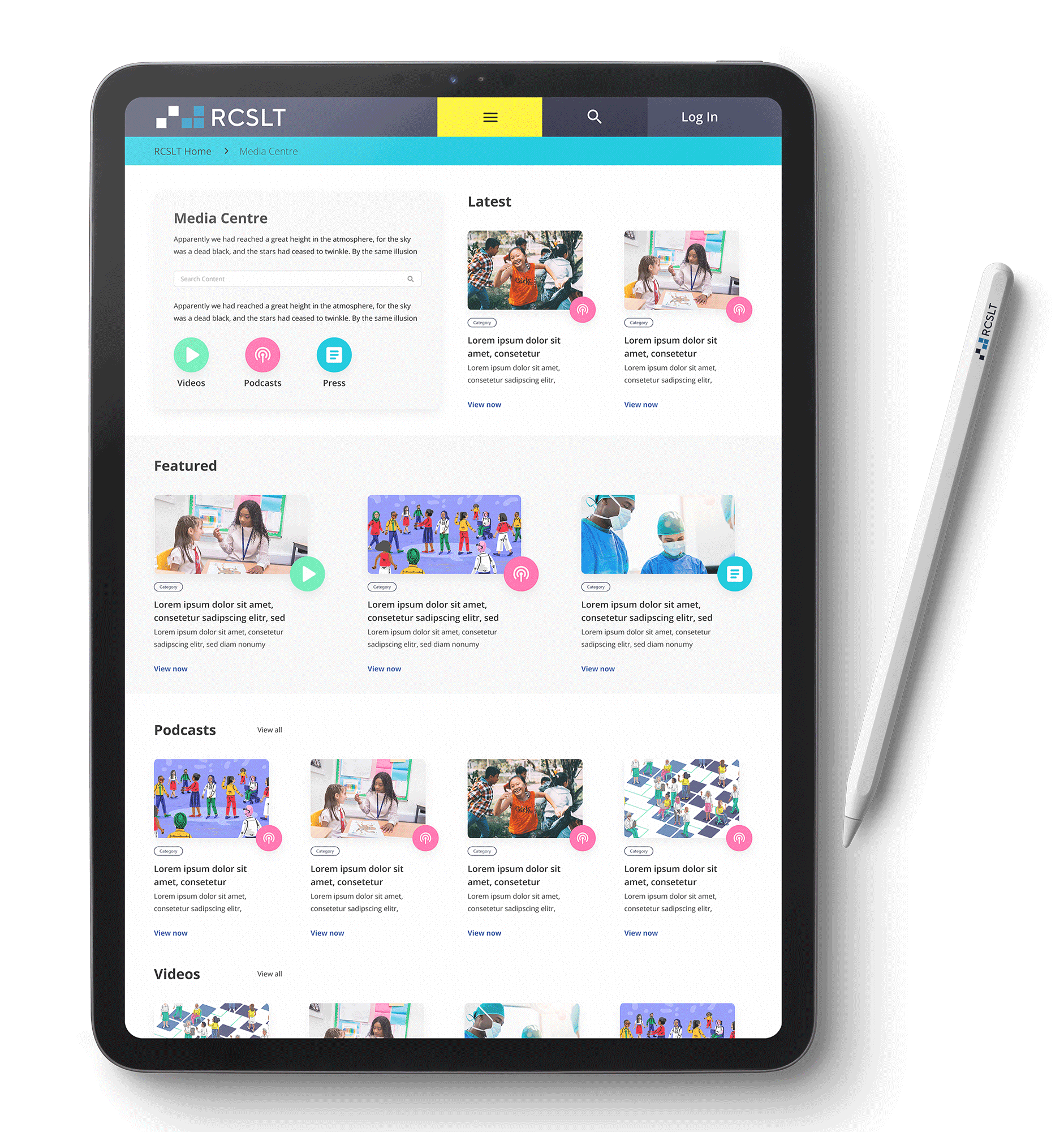
When we started, RCSLT's digital learning content was spread across multiple platforms. It was difficult to follow for users and a nightmare to manage on the back end — multiple systems needed for the same content. We undertook design research to understand both user and client needs, then brought everything onto a single new platform with a clear content structure. Using the design system, we could build, test, and iterate quickly. The result was one place for everything: easier to find, easier to use, and easier to maintain.
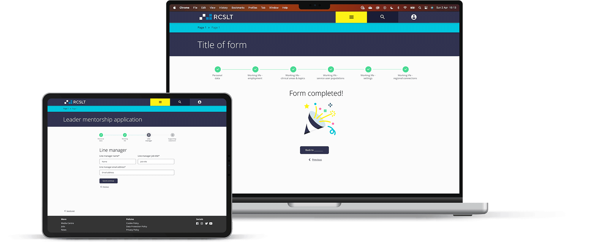
RCSLT needed to collect detailed, confidential data from speech and language professionals in their network every year. A single professional could face up to 10 separate forms. The whole process was paper based — sent out, filled in, sent back — which was slow, expensive, environmentally costly, and prone to errors that were hard to correct.
We designed and built a new data capture service, allowing professionals to complete forms securely online, with their data stored in RCSLT's Salesforce database. The new flow made it easy to return and update information, see what was outstanding, and understand what was being asked at each step. Errors dropped significantly. Admin time freed up. The design system kept the experience consistent with the rest of the service throughout.
Over two and a half years, I moved from lead UX designer into a delivery manager role as the design work matured and the focus shifted to database work and back-end improvements. I stayed involved in that side too — Salesforce, SQL queries, back-end code — which gave me a broader view of the project than a purely design role would have. It's the kind of project you don't often get: long enough to see the work land, iterate on it, and understand what the decisions actually meant for the people using it.
