UX & product design
Deep dive
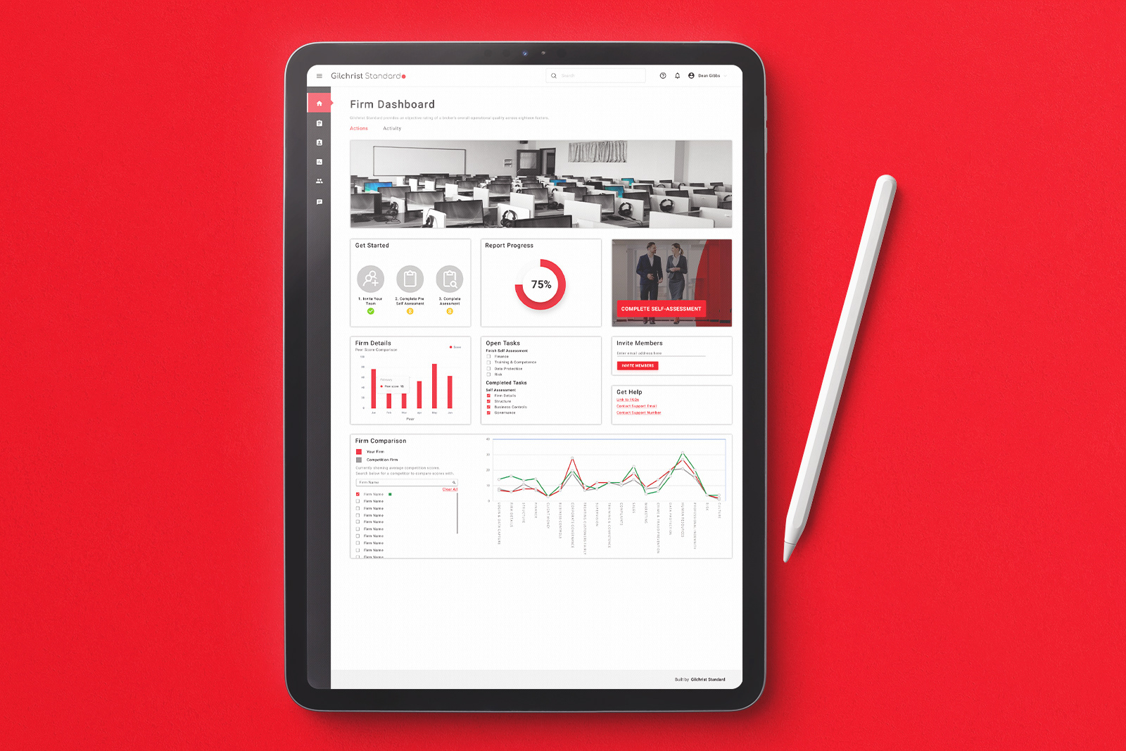
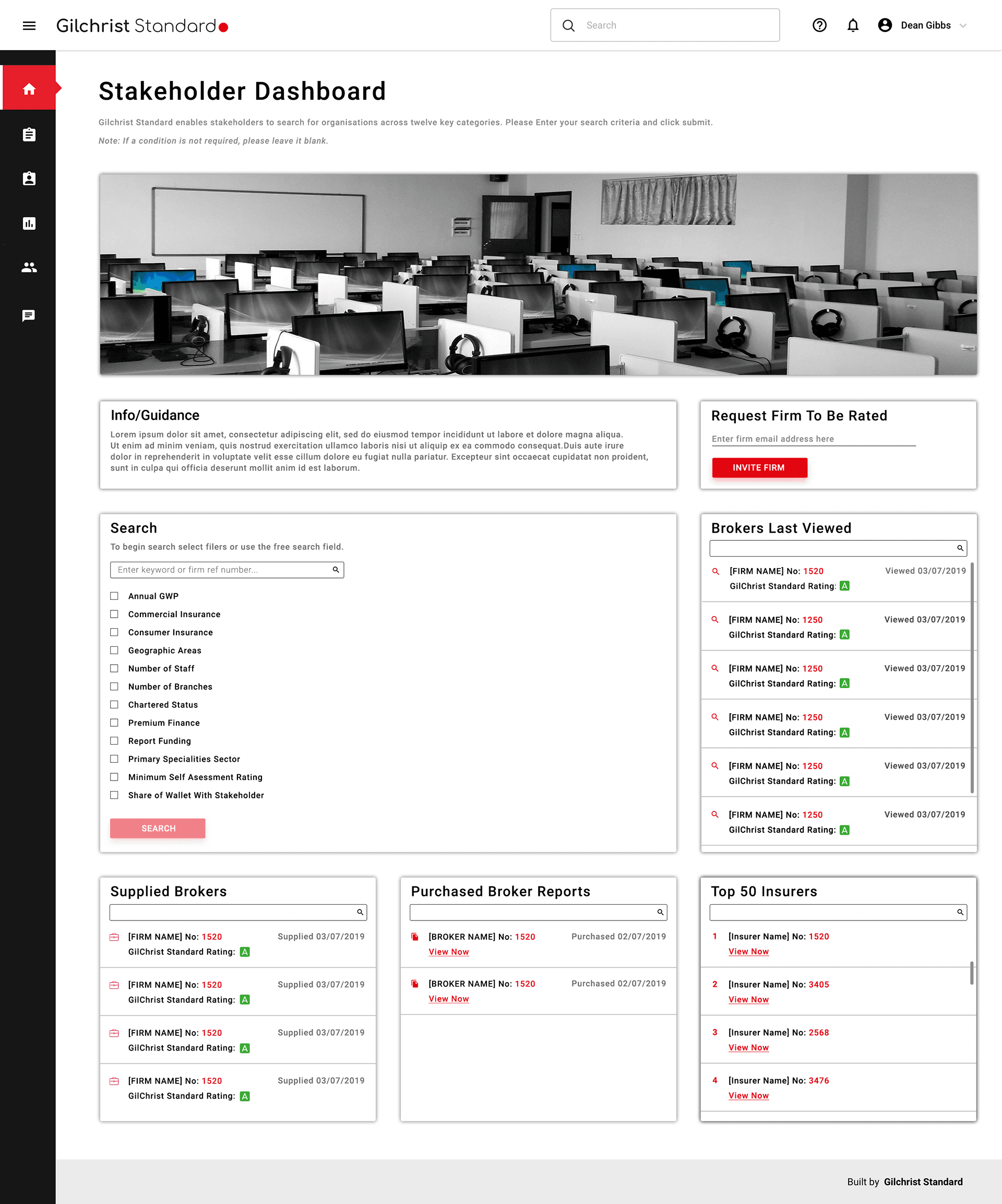
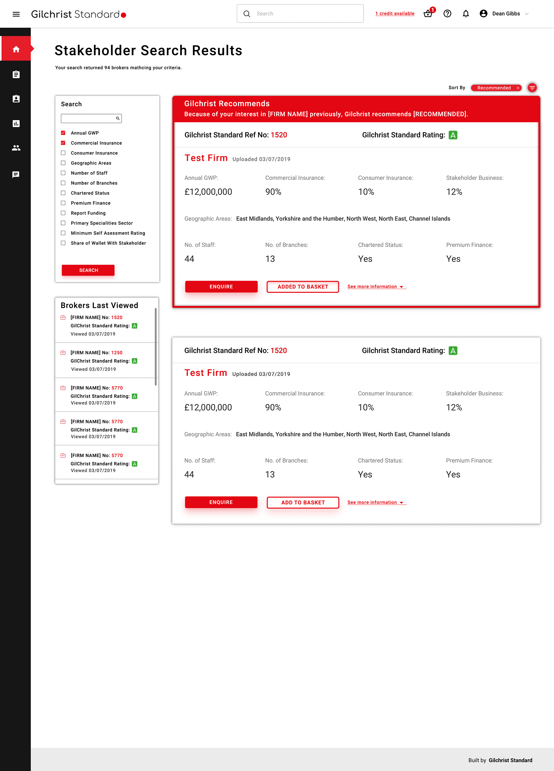
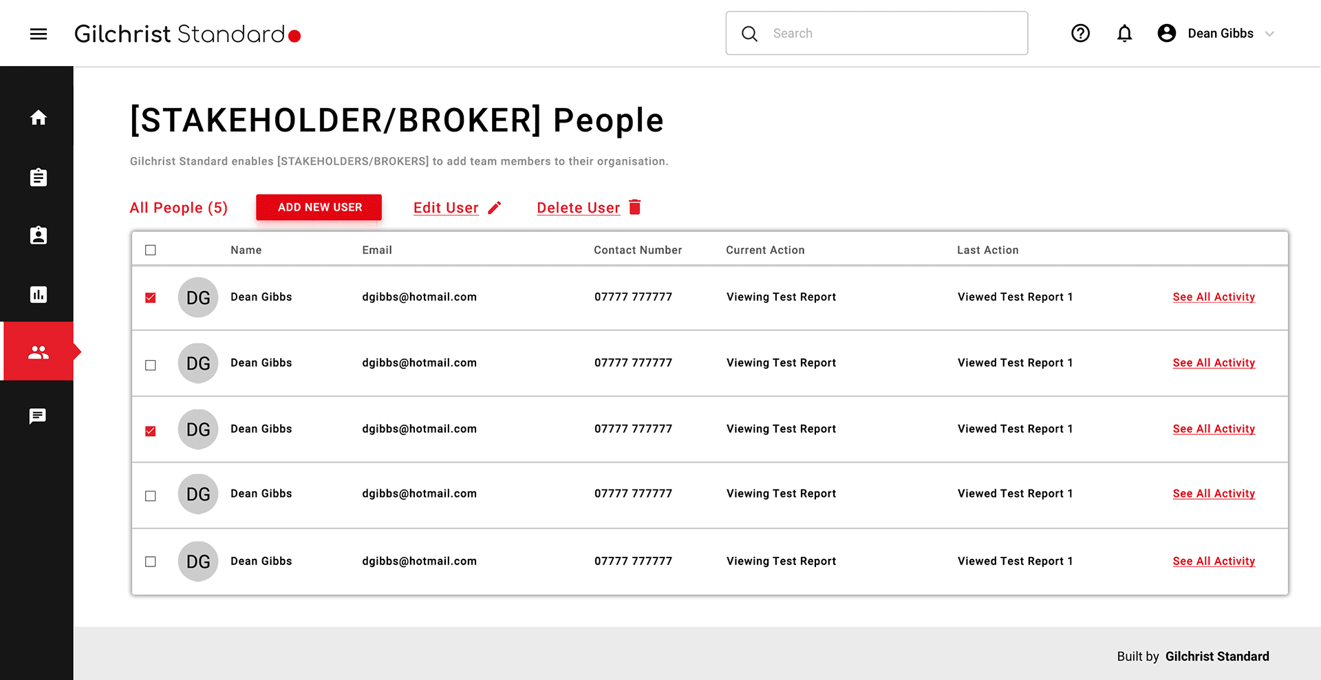
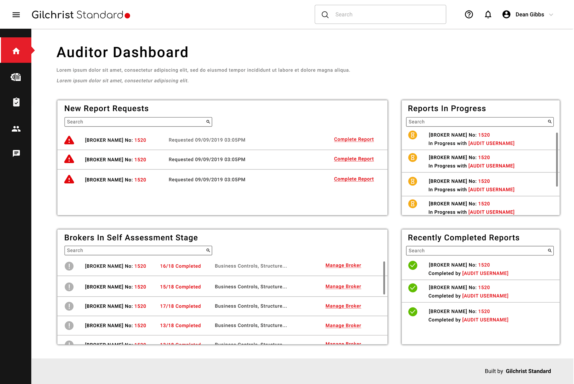
Gilchrist Standard needed a management system that worked for four different types of users — internal staff and external clients — without asking any of them to navigate an experience built for someone else.
Multi-user-type systems are hard. The temptation is to build one interface and use permissions to show or hide bits of it depending on who's logged in. That approach technically works. It rarely produces a good experience for anyone.
Four user types means four sets of goals, four sets of mental models, and four ways of thinking about what managing something means. Getting that wrong doesn't just make the product annoying — it makes it unusable for the people who need it most.
I started with stakeholder sessions to understand what each user type actually needed — not what they said they needed, but what the underlying job was. From that I built out personas and user stories for each group, which became the reference point for every design decision that followed.
The design work centred on making sure each user type had a clear, coherent path through the system. Shared components where it made sense. Distinct flows where it didn't. The internal and external experiences needed to feel like they belonged to the same product without colliding.
Designing for multiple user types well requires you to constantly pressure-test decisions against people who aren't in the room. A feature that simplifies things for an admin can create ambiguity for a client. Holding all four user types in your head simultaneously is genuinely demanding work.
It's also the kind of project where getting the research right at the start saves significant rework later. The persona and user story work wasn't process overhead — it was how we made sure the design stayed grounded in what users actually needed rather than what was easiest to build.